
Brand Identity | Naming and Brand positioning | Web design
Ready to eat Chaat that brings
the fun of street food to your home
Papri is committed to providing fataafat (ready to eat) chaat in a box that satisfies cravings anytime, anywhere. Our commitment to maintain authentic flavours and impeccable hygiene standards gives our customers the confidence to savour our chaat with absolute peace of mind. At the heart of our brand is a dedication to create memorable moments of joy through the irresistible flavours and convenience we provide. Through our brand, we envision becoming a symbol of celebration by bringing people together.


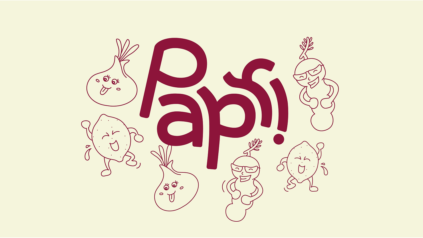
Our logo embodies the lively essence of chaat. Jumping letters capture the spontaneous and playful nature of chaat, evoking a sense of excitement. The design symbolizes festivities and togetherness, reflecting our belief that good food brings people together in shared moments of joy. The combination of rounded and sharp corners in the letterforms represents the refreshing sensation of mint and the crispy crunch of paapdi, 2 essential elements of chaat. The logo can either be used along with the Papri characters or the tagline. The illustration style is simple and energetic line art.


The icons have been carefully designed to compliment the outer curves of Papri's logo and the brand typeface- Baloo, with subtle sharp corners on the inside complimenting Ruddy, also conveying
the playful and lively nature of the brand at the same time.